Blimey, That Hurt: The UK Letterers Making Manga Sound Effects Hit Properly
There is a particular kind of silence in UK manga circles when a sound effect lands badly. You know the one. A character gets clobbered, the art is full of motion, the panel is screaming — and the letters just sit there like a typed apology. Thud. No weight. No snap. No reason to wince. Lettering is often called invisible work, but bad SFX is very visible. Good SFX is felt before it is read.
In 2026, UK small-press manga and indie comics are full of creators wrestling with exactly this. Japanese onomatopoeia does not always map cleanly onto English. A single katakana burst can carry impact, texture, comedy and tempo all at once. Translate it too literally and you get a word nobody says. Over-explain it and you kill the beat. The best UK letterers are not just swapping words — they are re-drawing rhythm.
The Sound Before the Word
Manga SFX often works like a visual instrument. The shape of the lettering tells you how loud it is, how fast it hits, whether it is funny or horrible. A tight vertical block of katakana feels different from a scrawled, spidery line across a quiet panel. That is why simply dropping in a digital font can feel wrong. The SFX has to belong to the drawing.
“You are matching weight first, meaning second,” says a Bristol-based letterer who works across small-press manga and zines. “If the line art is scratchy, a clean vector font with perfect kerning will look pasted on. If the impact is meant to be ugly, the letters should be a bit ugly too.”
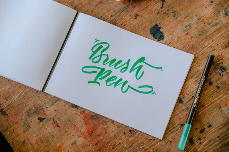
That might mean hand-lettering a big BAM with a brush pen, scanning it, then cleaning it up just enough. It might mean building custom letters in Clip Studio Paint or Procreate with a wobbly edge. It might mean using a chunky condensed font for a train-door slam and a thin, shaky line for a held breath. The tool matters less than the decision: what should this sound feel like in the reader’s chest?
From ドン to DUN: Translating Without Flattening
Japanese SFX are not a simple code. Doki doki is a heartbeat, but it can also be nerves, romance or dread. Gogo can be a rumble. Shiiin is silence with a side of awkwardness. A UK letterer has to decide whether to keep the Japanese term for readers who know the language of manga, or find an English equivalent that does the same job for everyone else.
A London-based small-press editor puts it plainly: “If the book is aimed at seasoned manga readers, keeping doki doki can feel natural. If it is a first manga for a younger reader, thump-thump might carry the scene better. Neither is wrong. The wrong move is refusing to choose.”
Impact sounds are trickier. Don might become BAM, THUD or WHAM, depending on the surface, the character and the tone. A comedy bonk should not sound like a horror-film door. A sword clash should not read like a kitchen accident. Letterers talk about “casting” a sound effect: finding the word that fits the scene’s genre, weight and pace. Sometimes the answer is not a word at all. A sharp white burst, a black impact star or a single hand-drawn !! can do more than a whole syllable.
Tools of the Trade: Brush Pens, Cracked Screens and Good Scans
Walk through any UK artist alley and you will hear the same confession: SFX is where pages go to die at 1am. Letterers are often working on tight budgets, with files that have been through three different screens and a group chat. The kit is practical rather than glamorous. Brush pens for marks. A scanner for texture. Clip Studio Paint for balloons and clean-up. Procreate on an iPad for quick tests. A cheap graphics tablet that has seen things.
One Glasgow-based creator says they keep a scrap file of sounds: bus brakes, pub doors, chip-shop fryers, the exact noise of a shopping trolley hitting a kerb. “You record the world, then you draw it,” they say. “A CLUNK that has never been heard in real life is just a font choice.”
Hand-lettering also helps with the “graffiti” energy that many manga SFX carry. Big, brash, outlined letters can feel like street art, but they need to sit in the panel rather than float above it. Letterers use halftones, white knockouts, rough edges and perspective to make the sound feel part of the drawing. The goal is not neatness. The goal is impact with control.
Regional Slang and the Risk of Over-Explaining
British slang can add flavour, but it is a minefield. A character shouting “Oi!” or muttering “proper mardy” can feel brilliantly local. A sound effect labelled “KERFUFFLE” in the middle of a fight scene can feel like a cartoon trying too hard. The UK letterers I spoke to were cautious about slang in SFX specifically. Exclamations and dialogue can carry regional voice. Sound effects usually need to be immediate.
“You have about half a second to read an SFX,” says one Manchester-based letterer. “If the reader has to decode it, the panel has already lost its momentum. Use a footnote if you must, but do not turn a punch into a vocabulary lesson.”
That is the line between localisation and over-explanation. A glossary at the back can be useful for cultural terms or untranslatable jokes. It is less useful for a fist hitting a jaw. In those moments, clarity and rhythm win. The reader should feel the hit, not admire the research.
Before and After: What Changes on the Page
In sample pages shared by small-press creators, the pattern is consistent. A Japanese SFX might occupy a narrow vertical strip beside a character’s shoulder, building tension before a strike. The UK version often keeps that placement but changes the letter shape, making the word lean into the action rather than sit beside it. A comedic poka becomes a bouncy BONK with a rounded outline. A quiet shiiin becomes a trail of dots and a tiny hush, depending on the scene’s register.
The best before-and-after examples do not look like translations. They look like the page was drawn that way from the start. That is the real craft. The reader is not meant to notice the decision-making, the font tests, the three rejected versions of THWACK or the letterer’s 2am debate about whether a door goes SLAM or BANG. They are meant to hear the page.
The Beat Goes On
UK manga lettering is not about making Japanese sound effects “British” in a cuddly, tea-and-biscuits way. It is about preserving the beat while changing the language. Sometimes that means a direct swap. Sometimes it means a completely new mark. Sometimes it means trusting the art to do the shouting and giving the letters a smaller, sharper job.
So next time a panel makes you flinch, grin or hear a train door close, spare a thought for the letterer. They have been in the margins, arguing with a brush pen, trying to make BAM feel like it actually hurt. Blimey, that is harder than it looks.