Corner Shop Panels: The UK Artists Turning Ordinary Streets into Manga Backdrops
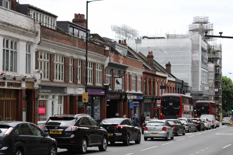
Ask a UK manga artist what they draw when they are stuck, and you will often get the same answer: the view from the bus window. Not a fantasy skyline or a neon crossing. A row of bins outside a bakery, a bus shelter with one cracked panel, the flat grey above a retail park. In 2026, that ordinary stuff is becoming some of the most interesting background art in British small-press manga and illustration.
At Vyvymangaa, we have been watching this shift with interest. The UK manga scene has always been good at remixing influences, but there is a particular energy right now around setting. Artists are not simply drawing Britain in a manga style. They are using manga's visual language — clean perspective, selective detail, emotional weather — to make British streets feel as expressive as any fictional city.
The background is the character
In manga, background art is rarely just scenery. A classroom window, a riverbank or a convenience store aisle can carry mood, memory and class detail. UK artists are applying that same logic to places they know intimately: the corner shop that stays open late, the bus stop where the timetable is always slightly wrong, the terraced street whose brickwork changes colour in the rain.
Mina Okonjo, a Leeds-based illustrator, calls it 'drawing the furniture of your own life'. Her short comics often place quiet character moments against backdrops of takeaway signs, wheelie bins and the kind of low-rise retail parade that rarely makes it into glossy art books.
'If you grow up here, you learn to read a street by its small clues,' she says. 'The chippy light. The shutter that half-works. The way a bus shelter collects people at 4pm in winter. Those are not boring details to me. They are the whole atmosphere.'
Four artists on corner shops, bus stops and brick
Cal Rennie, a Glasgow-based comics artist, uses tenement closes and rain-darkened pavements as recurring motifs. He says the trick is not to make Britain look like Japan. It is to trust that British material can hold the same visual weight.
'Manga taught me to use negative space,' he explains. 'A panel with a character standing under a bus shelter can be mostly sky and concrete. The emptiness is doing the work. If you fill every inch with detail, you lose the loneliness or the calm.'
Priya Shah, who draws from Birmingham, is interested in the way British high streets mix eras. A Victorian terrace, a 1990s shopping centre and a new-build block can appear in the same view. She uses one-point perspective to make those layers feel deliberate rather than messy.
'I like the honesty of it,' she says. 'A British street is not a postcard. It is a collage. Once you accept that, the background becomes a way of talking about history without writing an essay.'
Hannah Pike in Bristol takes a softer approach. Her work uses watercolour washes and screentone to capture the grey-blue light of a wet afternoon. She often sketches on location, then simplifies the drawing later.
'You cannot copy every brick,' she says. 'You choose the bricks that rhyme. A few windows, a drainpipe, the shape of a roof. The reader's brain fills in the rest. That is the manga trick, really: suggest more than you show.'
Technique: make the grey do something
There is no single UK manga background style, but several practical habits keep coming up. The first is limited palette. Grey skies can flatten a drawing, so artists often introduce one or two anchors — a red shop sign, a yellow coat, the green glow of a pharmacy cross — to give the eye somewhere to land.
The second is selective hatching. Rather than rendering every surface, artists use texture where it carries meaning: rough brick for age, smooth glass for distance, wet tarmac for mood. The third is signage. Shop names, bus numbers and noticeboards can place a scene instantly, but too much text clutters a panel. Many artists blur or crop signs so the feeling survives without turning the background into a directory.
Perspective matters too. A terraced street has a natural rhythm, and manga's strong vanishing points can make that rhythm feel almost musical. The same goes for bus interiors and supermarket aisles: ordinary spaces become stages when the angles are confident.
Why readers are responding
For UK readers, recognition is a rush. Fans have spent years reading manga set in Japanese cities, and those settings are part of the pleasure. But there is a different thrill in seeing a bus stop you have stood at, or a corner shop that looks like the one near your nan's house.
That does not mean the work is parochial. The best of it uses local detail to reach universal feelings: waiting, queuing, killing time, walking home in the dark. The background says 'this is here' while the story says 'this is anyone'.
Small-press fairs and library comics groups have helped this work find readers. Zines passed hand to hand at events such as Thought Bubble, and sketchbook tables at MCM London, have created a community around British setting art. The response is often the same: I did not know you could draw that.
Try it in your own sketchbook
You do not need a grand view to start. Pick a bus stop, a launderette or the queue outside a chip shop. Draw it three times: once as a straight observation, once with the colour reduced to two tones, and once as a panel with a character waiting. Notice which version carries the most feeling.
The point is not to make Britain look exotic. It is to look properly. UK manga artists are showing that the background behind our everyday lives has been full of panels all along — we just needed to frame it.